Sunday, May 10, 2009

final site plan


the image above is a drawing of the final site plan, showing the proposed medians along Lee street and the paths which get you around and into the building

Lee street elevation


the image above is showing the Lee street elevation of the exterior.  This image also shows how the concept is applied, that was mentioned in the previous post.  With a more dense human scale as you would enter the building and a more sparse large scale as you move further away.

Studio Final team DF7A26-landscape

Below are the final renderings for the landscaping portion for team DF7A26.  The major concept guiding the design for the landscape was to take this enormous building down to human scale as you would approach and enter the building, to give time to take it all in as you would enter.  From the McCormick side of the building it is more open with larger plant life and becomes more dense and consists of smaller more human scale plant life as one would approach the entrance of the building.  At the entrance there are planters with seating and two rock garden areas as well.  There is also a water fountain located at the entrance next to one of the rock gardens to add variety of sound and texture, as well as a peaceful place to sit and relax among the business of Lee street.  The parking area located on the ground level can be accessed from McCormick , and is somewhat hidden behind a green screen wall.  The lines/voids that are in the green screen wall are an abstract graphic for replicating motion, as the train passes by.

Lee street median proposal

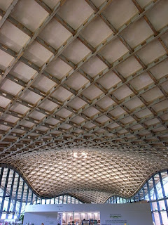
plan view of atrium entry

view from bus stop toward front entry

paths to atrium and Lee street

corner of McCormick and Lee street

Rock garden seating area

parking to left with green screen wall

detail of green screen design


view from Lee street 

Monday, April 27, 2009

more out of sketch book and into SketchUP


Above are some more site images, as I bring my sketches to the 3d world of SketchUP, comments and suggestions welcomed!  Note: there is an existing building located on the right that is not shown, that is why there is a lack of landscaping around that area, I plan to add a bit more on that side to work around the existing building.

Sunday, April 26, 2009

entrance development


above are images showing the development of the main entrance into the building.  I have a few questions pertaining to the design of the front planters.  1) Do they two planters to the left need to be raised for seating, or should I keep them at ground level and put granite rocks for seating as on the right? 2) Should I introduce more landscaping to the left of the site, or should I leave this space open?  There is also an entrance from McCormick to the parking areas, which is not shown here ( there will be landscaping around this areas as well, and there will be Green Screen located at the ground level parking deck)  Please feel free to leave me some comments for the questions I have above, or any other suggestions.

paths


materials model


Tuesday, April 14, 2009

Medians + Sidewalks


Things to consider for re-design of site:
- Medians
- Bike lanes
- Sidewalks
- Pedestrian crossings

Above are some images I found useful when developing the site

Monday, April 13, 2009

a few thoughts

While I sit here and work on my geography paper, my mind wonders into other thoughts.  One of these thoughts pertaining to materials used in the studio project.  I was thinking that Luccon (translucent concrete) could be used for vertical circulation in the building.  It would be cool to see shadow figures traveling from floor to floor, with possibly a few breaks in the translucent concrete to where the shadowy figures could be seen in a glimpse and then to somewhat disappear again behind the concrete.  Also, another thought was for parking.  We have talked about not having parking, however, the more I think about it I believe it is a must.  This parking located under the architecture studios could serve as visiting guest speakers, for lectures, special events (like held at the Weatherspoon Art Museum), handicap spots, and for people taking the train that do not attend UNCG.  Just thought I would jot these thoughts down before I forget and get swallowed back into the world of geography, edge cities, to be exact.

Thursday, April 2, 2009

and again

Below are some other images I came across that intrigued me.  The first is another view of the Capital Hill Residence by Zaha Hadid.  I like this image because of how the building seems to have these separate units, however, it is indeed all connected as one.  Which reminds me of my groups "pods", and this can aid us in how to join these or at least make them seem as if they are one.


The one below is another example of how we could form our roof surface, and a way to allow for exterior spaces.  It is a project done by Graft, who has some awesome projects worth taking a look at!


in search of a new roof form

I came across this particular image, and thought that we could use this as an example for translating our roof form into a more simple and streamlined form.  This particular building is by Zaha Hadid - "Capital Hill Residence"


The sweeping form brings to mind motion, which is exactly what our building needs.  To represent the train when it is not passing through, to have this constant state of motion to the building.


review thoughts

After my groups review today we have decided to make some major changes.  Among these changes the main one would be to decrease the square footage!  Which I had been questioning every time we met as a group, I would always ask why we needed all this extra square footage, and I do recall saying that I thought our building should not be over 150,000 square feet, but it got lost in the process.  Partially this is my fault for not voicing my opinion more often (which I will be working on for the remainder of the semester).  But hopefully now we can take this estimate as a realistic goal for the little time we have left of the semester.  I will be working on sketches tonight and meeting with my group in the AM.  I feel that the review today was a reality check for the project and also a recap from our last review.  Maybe this time it will sink into our heads, and we can come up with a positive solution that we can move forward with, instead of running circles chasing our own tails.  

Landscape inspiration

Thursday, March 26, 2009

Food for thought

As my group struggles to grasp exactly what our "skin" will look like or even how it will work we came across this building.  This will be our main model when it comes to applying the skin to our building form.


The train comes above ground!

After further thought the train is indeed being moved above ground.  Here are a few inspirational images : )


Building form further explored

The following drawings are my groups revised and refined building form sketches.  We have also decided to raise the tracks! Raise the tracks above the ground and celebrate them, also we extended the building along the tracks to allow for various views and experiences with the train as it runs parallel to our building.


Wednesday, March 18, 2009

Material study

The following materials were investigated for the use in the design project, these various materials have a range of applications.  These applications range from wall covering, flooring, ceiling, room partitions, stairs, countertops, and even signage.